responsibilities
brand design
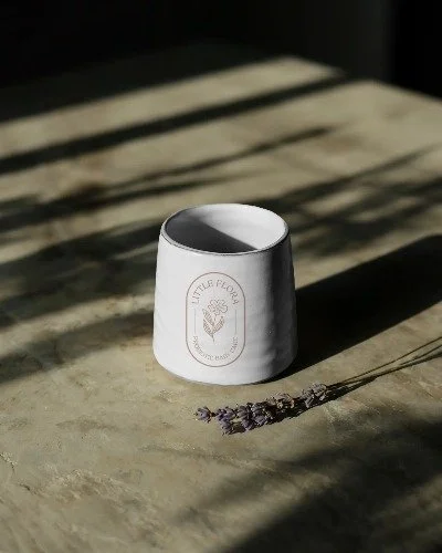
packaging design
the challenge
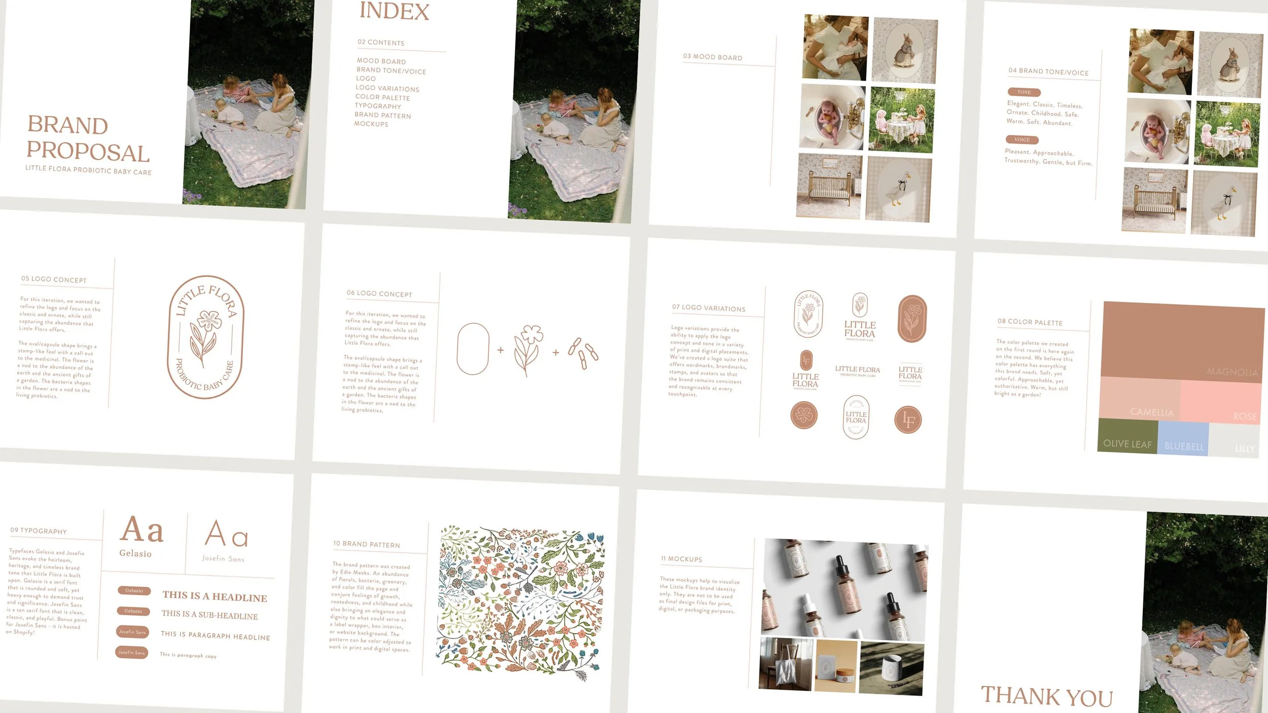
Little Flora Probiotic Baby Care was created by a Boulder mom of two who couldn’t find a skincare product for her eczema-prone son. After completing the formula and ready-ing it for manufacturing, she need a full brand and packaging design that spoke to the ancient and abundant power of probiotics while marketing to the high-end, G-wagon moms of Boulder County who buy organic berries, but still get botox.
solution one
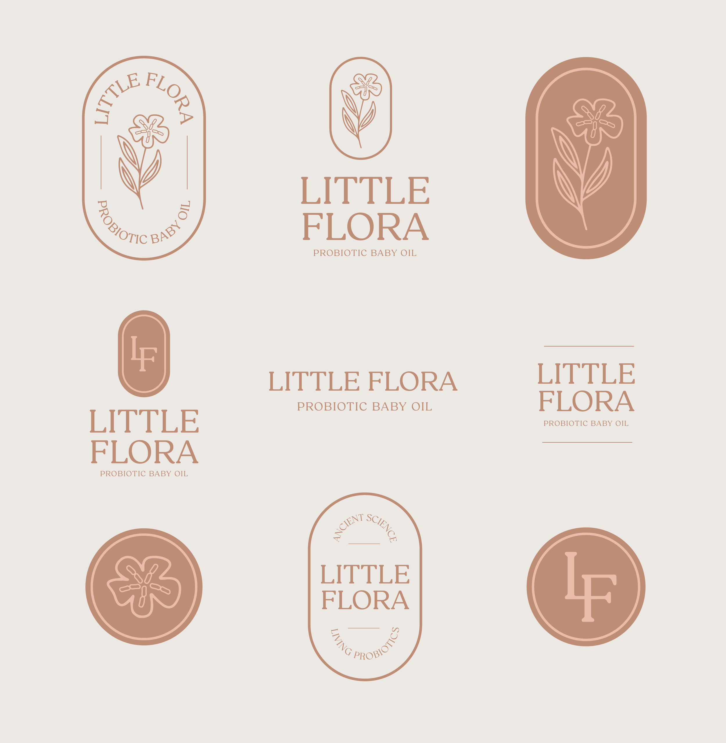
design a logo suite that spoke to each facet of Little Flora’s mission. In our discovery call, the founder of Little Flora asked for a logo that was elegant, but felt baby-friendly, incorporated the shape of probiotics, and evoked the richness of a garden in bloom. We decided to propose a full logo suite - one that offered logos for packaging, web, and social and utilized the brand marks that she loved so much.
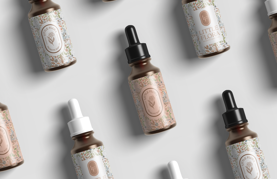
solution two
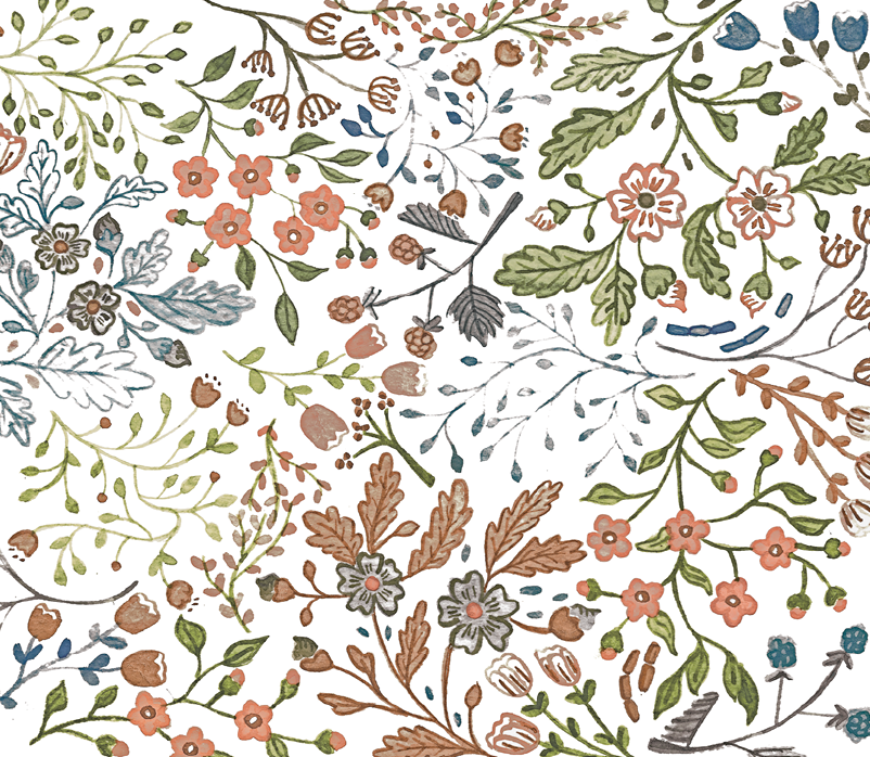
working in collaboration with Edie Meeks, a water colorist from Minneapolis, we designed a brand pattern for Little Flora to be used on baby oil droppers and external packaging. The floral pattern speaks to abundance and the colors bring an elevated and elegant style to the brand.
solution three
combining the logo and brand pattern, we designed stickers for the baby oil bottles to be used in product packaging down the road. the detailed, handdrawn florals are eye-catching and beautiful, a bottle that people will want to refill or hold on to long after the product itself is gone.